7 Ways to Improve Website Navigation for Better Sales
Your website’s navigation can make or break your sales. 55% of users leave websites due to poor navigation, while 38% focus on navigation links during their first visit. Here’s how you can fix that and guide users toward purchases:
- Simplify Your Menu: Keep it clean with 5–7 items and clear labels. Use mega-menus only for large catalogs.
- Optimize Buy Buttons: Use bold colors, strategic placement, and compelling text to increase clicks.
- Mobile-Friendly Design: Use collapsible menus, large tappable elements, and sticky action buttons.
- Add Search Boxes: Position them prominently, include autocomplete, and ensure typo tolerance.
- Organize Pages Logically: Use clear categories and ensure users can reach any page in 3 clicks.
- Track User Behavior: Use heatmaps and analytics to refine navigation based on real user actions.
- Incorporate Smart Tools: Add AI-powered navigation, personalized CTAs, and chat widgets for better guidance.
These strategies don’t just improve usability – they directly impact conversions. Ready to make your site easier to navigate and boost sales? Let’s dive in!
Optimizing Website Navigation Increased Conversion Rate by …
1. Keep Your Menu Simple
A cluttered menu can confuse visitors and hurt sales. Studies show nearly 50% of users depend on the navigation menu when they land on a website through search or referrals.
The "Rule of Seven" is a helpful guideline for designing effective menus. Eric Kazda from Quantum Dynamix explains:
"The short-term memory can only hold seven items at a time. If your menu is longer than seven items, the user experience suffers."
Here’s how to build a navigation menu that drives sales:
- Plan Your Information Architecture First
Before diving into menu design, map out your site’s structure. Nick Babich emphasizes:
"IA design should be finished before the product team starts to design the navigation system."
- Organize Strategically
Align your menu with user needs and business goals. For larger catalogs, mega-menus can simplify navigation.
Key tips for menu design:
- Limit top-level navigation to 5–7 items.
- Use clear, descriptive labels that reflect your offerings.
- Group related items logically.
- Add breadcrumbs for sites with deep page hierarchies.
- Use mega-menus for large product catalogs only.
Simple menus make it easier for visitors to find what they need, increasing the chances they’ll complete a purchase. Eliminate unnecessary menu items and focus on directing users to your most important products or services.
If your site requires multi-level navigation, use dropdown menus carefully. Overloading them can frustrate users, so make sure every item has a clear purpose and supports the visitor’s path to conversion. A clean, focused menu sets the stage for strong calls-to-action that guide users toward completing their goals.
2. Place Clear Buy Buttons
Where you put and how you design your buy buttons can make or break your sales. Did you know abandoned carts lead to over $4.6 trillion in lost annual sales worldwide? Let’s talk about how to make your buy buttons work harder for you.
- Color and Contrast: Make sure your button stands out. For example, Laura Ashley saw a 7% increase in checkout completions just by changing their "Go to checkout" button from dark gray to green. Similarly, ContentVerve.com saw a bump in sales by making a similar color adjustment.
- Strategic Positioning: Place your buy buttons where they’ll be noticed – below product descriptions, next to images, and at decision points. Ideally, they should appear both above and below detailed product information.
- Compelling Button Text: The words on your button matter. ContentVerve.com increased click-through rates by 200% by tweaking their button text from "Get your membership" to "Find your gym & get your membership". UX expert Janie Kliever puts it best:
"Details DO matter – in design in general and when creating call-to-action buttons."
- Size and Spacing: Make your buttons easy to click, especially on mobile. They should be large enough and surrounded by enough whitespace to avoid accidental clicks.
- Trust Indicators: Add security badges and payment icons near your buttons. These small details help reassure customers, especially when they’re about to check out.
Don’t forget to test your button placement and design on desktop, tablets, and mobile devices. Consistency across all platforms is key to ensuring they’re always visible and easy to click.
3. Make Navigation Work on Phones
With smartphone users spending an average of 3 hours and 15 minutes daily on their devices, it’s crucial to design mobile navigation that is easy to use and optimized for conversions. Here’s how you can make your mobile site as effective as your desktop version.
Make Tapping Easy
Interactive elements like buttons and links should be large enough for users to tap without frustration. A good rule of thumb is to design them at least 44×44 pixels. This reduces accidental taps and ensures smoother navigation, which can directly impact sales.
Use Space Wisely
Mobile screens are small, so every bit of space counts. Here are two ways to make the most of it:
- Collapsible Menus: A hamburger menu can save space while keeping navigation accessible. For example, Spotify replaced their hamburger sidebar with a bottom navigation tab, leading to 9% more clicks and a 30% increase in menu engagement.
- Strategic Placement: Place critical elements like search buttons where thumbs naturally rest. Sticky buttons for actions like "Add to Cart" or "Buy" can also boost usability by staying visible as users scroll.
Keep Navigation Simple
A clean, efficient menu structure helps users find what they need quickly. Follow these tips:
- Limit top-level navigation to 4–8 items.
- Space menu items at least 32 pixels apart to avoid mis-taps.
- Use high-contrast colors to make navigation elements stand out.
- Enable horizontal swiping for smoother transitions between pages.
"Creating a mobile-friendly navigation means creating a customer-friendly navigation that gets your personas moving in the right direction right away." – Bruce Clay
Test on Real Devices
Testing is key to success. Research shows that 42% of mobile e-commerce sites fail to clearly communicate their purpose through homepage design. Use tools like screen recordings and heatmaps to see how users interact with your navigation and make adjustments as needed.
sbb-itb-bdfd21a
4. Add a Search Box
A strong search feature can significantly boost conversions. In fact, 43% of retail visitors begin with a search, and those who use it are 1.8 times more likely to convert.
Position Your Search Bar Strategically
Place the search bar where users naturally expect it – usually in the top-right corner of your site. To make it noticeable:
- Use contrasting colors to draw attention.
- Keep the placement consistent across all pages.
- Include a clear search button with a magnifying glass icon or a “Search” label.
Improve Search Functionality
A poorly designed search feature can cost you up to 68% of potential customers. To make your search effective, consider:
- Autocomplete: Offer suggestions as users type.
- Typo tolerance: Deliver results even when users make spelling errors.
- Synonym matching: Help users find items despite different terminology.
- Smart filters: Allow users to refine results by price, category, or other criteria.
"Data-driven optimization is key to improving user experience on the website. Analyze your customers and address their challenges, whether it’s difficulty finding specific products or pages, to determine the focus of your optimization efforts on site search or navigation box."
– Dinar, Searchanise Data Analyst
Make It Mobile-Friendly
With 77% of online purchases happening on mobile devices in Q2 2024, your search bar needs to perform seamlessly on smartphones. Ensure it is:
- Large enough for easy tapping.
- Responsive across all screen sizes.
- Equipped with voice search capabilities.
Once optimized for mobile, make sure your search feature provides helpful guidance even when no results are found.
Handle Zero Results Gracefully
When no results are available, don’t leave users stranded. Instead, offer:
- Related suggestions
- Alternative categories
- Popular items
- Search tips
Keep the original search term visible to help users refine their query.
Shoppers who use search features are 500% more likely to convert and spend 600% more per user compared to those who don’t. By implementing these strategies, you can turn your search bar into a powerful conversion tool.
5. Organize Your Pages Logically
An effective menu is just the start. Structuring your website in a logical way makes navigation easier and can even improve conversions.
Focus on Your Customers
Your website should reflect how customers think, not how your company is organized. Here’s how to do it:
- Map Out Your Content
Create a sitemap with a simple structure, aiming for users to reach any page within three clicks. For example, Invesp improved product category organization and saw an 18.5% increase in conversion rates. - Try Card Sorting
Involve your audience in card sorting exercises. This helps you group content in a way that feels natural to them.
Use Clear Categories
When setting up your pages, choose a navigation style that fits your site’s purpose:
| Navigation Type | Ideal For | Example Categories |
|---|---|---|
| Object-based | Product-focused sites | Shoes, Clothing, Accessories |
| Action-based | Service-oriented sites | Shop, Learn, Compare |
| Audience-based | Platforms with different user groups | Students, Professionals, Enterprise |
Well-defined categories paired with strategic placement make it easier for users to engage.
Smart Placement of Categories
Where you place navigation items matters:
- Put the most important links at the start of your menu.
- Place secondary options in the middle.
- Add contact details or less critical links toward the end – usually on the far right for horizontal menus.
For mobile users, keep shopping links separate from other content to make browsing simpler.
Monitor and Adjust
Use analytics to track how users move through your site, spot where they drop off, and adjust your navigation to improve conversions.
Add Visual Cues
Help users understand where they are on your site by:
- Adding breadcrumbs to show their current location.
- Highlighting key navigation elements with contrasting colors.
- Keeping navigation consistent across all pages.
These small changes make a big difference in helping users find their way.
6. Track How Visitors Use Your Site
Understanding how visitors interact with your site is key to improving navigation and boosting sales. By analyzing user behavior, you can validate and refine the navigation improvements you’ve implemented.
Use Heatmaps to Understand Visitor Behavior
Heatmaps provide a visual representation of user activity, showing where visitors click, scroll, and move their cursors. Warmer colors indicate high interaction, while cooler colors highlight areas with less activity. This information helps you:
- Spot buttons or links that users ignore
- Identify elements users mistakenly assume are clickable
- Analyze how far users scroll on a page
- Detect navigation issues and patterns
Types of Heatmap Analysis
| Heatmap Type | Insights Provided | How It Helps |
|---|---|---|
| Click Maps | Shows where users click or tap | Evaluates the effectiveness of CTAs and navigation elements |
| Scroll Maps | Displays how far visitors scroll | Guides content placement and button positioning |
| Move Maps | Tracks mouse movement | Highlights areas where users pause or focus their attention |
Real-World Example: Netflix‘s Interface Update
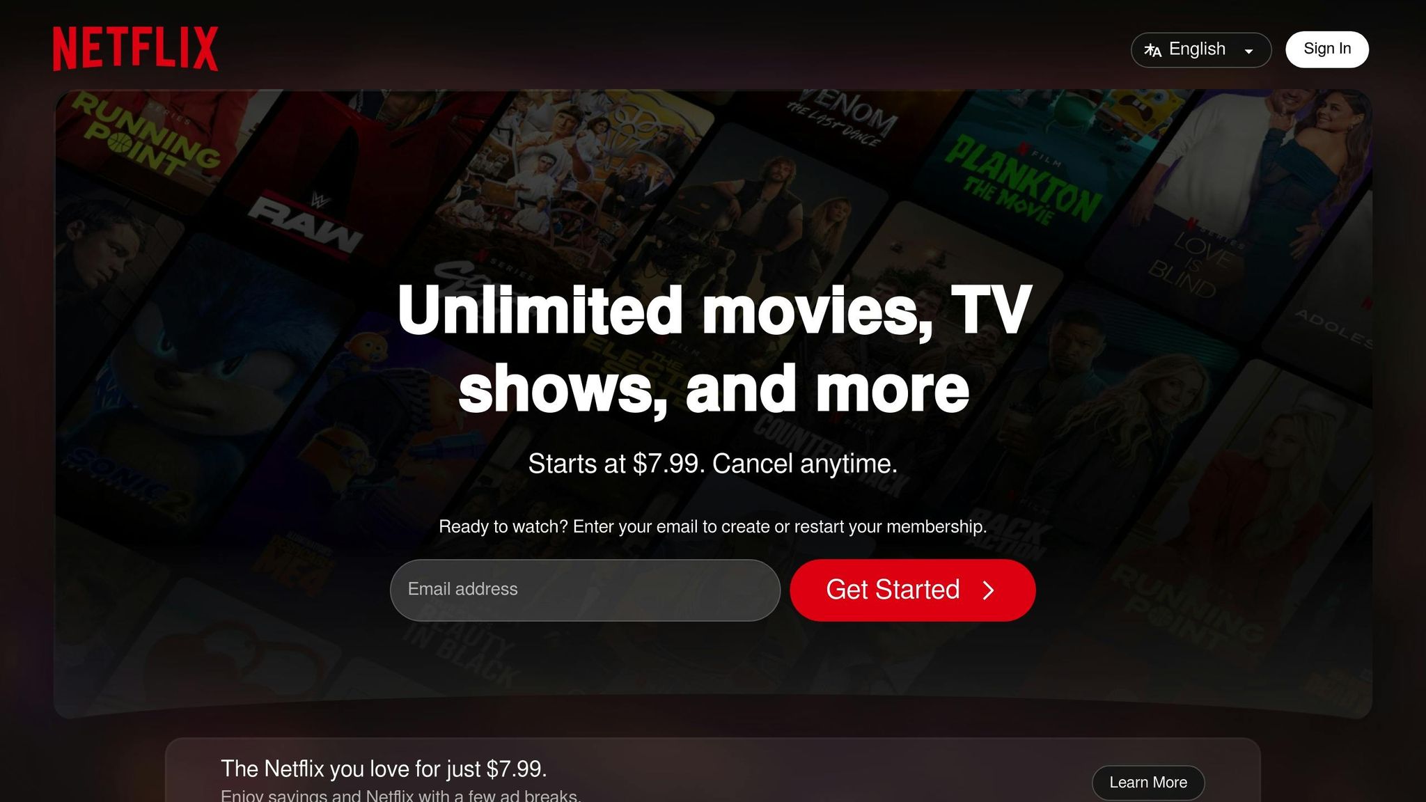
In 2013, Netflix revamped its interface after studying eye-tracking heatmaps. These maps revealed that users found it difficult to read text descriptions placed on the right side of the screen, while titles were on the left. By moving descriptions above the titles, Netflix made navigation much easier and more intuitive.
Use Analytics Tools for a Broader View
To fully understand how effective your site’s navigation is, combine heatmaps with other analytics tools:
- Monitor Key Metrics: Keep an eye on bounce rates, time spent on key pages, and user flow.
- Watch User Sessions: Record and replay user interactions to see where visitors face challenges.
- Segment Your Data: Compare behavior between new and returning users to address their specific needs.
These tools provide a clearer picture of how users navigate your site, helping you make data-driven decisions to improve their experience.
Turn Insights Into Action
Use the data you collect to make targeted improvements:
- Place important content in areas with high engagement, as shown on heatmaps.
- Rework navigation elements that users overlook or avoid.
- Test new button placements based on cursor movement patterns.
- Address issues like "rage clicks", where users repeatedly click out of frustration.
"Website heatmap is a data visualization tool that helps businesses understand how particular pages on their website are performing." – VWO
AI-generated heatmaps are now highly accurate, with up to 95% precision in predicting user behavior. Regularly reviewing and acting on this data can lead to noticeable improvements in your site’s performance and conversion rates. Use these insights to refine your navigation and create a smoother user journey.
7. Add Smart Navigation Tools
Smart navigation tools can help guide visitors toward making a purchase while improving their overall experience on your site. By incorporating these features, you can make the buying journey smoother and boost conversions.
Use Smart CTAs
Smart Call-to-Action (CTA) buttons can dynamically adjust based on factors like:
- Geographic location
- Device type
- Traffic source
- Language preference
- Customer lifecycle stage
This level of personalization ensures returning and new visitors see options that are most relevant to them.
Leverage AI-Powered Navigation
The Contact Button is a customizable widget that combines multiple navigation tools into one. Here’s how it can help:
| Feature | How It Helps |
|---|---|
| Contact Forms | Captures leads quickly |
| Click-to-Call | Offers instant assistance |
| Booking System | Simplifies scheduling |
| Chat Widgets | Provides real-time support |
These tools work together to guide users naturally toward actions that matter, complementing any existing navigation improvements.
Success Stories in Action
Companies using smart navigation tools have seen measurable results:
- Cask tailored its website for 10 different buyer personas, reaching over 37% of active visitors.
- Contech boosted content consumption for its DuroMaxx product line by 80% with guided navigation features.
- BRANDED Agency improved its digital strategy by delivering targeted content to specific user personas.
Ensure Device Compatibility
Smart navigation tools are designed to perform consistently across all devices, whether users are on desktops, tablets, or smartphones.
Seamless Integration
These tools can easily integrate with:
- Content Management Systems like WordPress and Shopify
- Email Marketing Platforms like Mailchimp
- Scheduling Tools like Calendly
- Customer Support Systems like Intercom
This integration simplifies the user journey while gathering useful data for your business.
Track and Refine
Keep an eye on key performance indicators like:
- Button click rates
- Form submissions
- Booking completions
- Chat engagement metrics
Use these insights to fine-tune your navigation strategy. Regular adjustments ensure a smoother user experience and better sales outcomes.
Conclusion
Good navigation is key to driving sales by helping users find what they need and make purchases. With 55% of visitors leaving websites due to poor navigation, improving your site’s navigation can make a big difference in turning visitors into customers.
- Simple Menu Structure
A clean, easy-to-use menu is essential since 38% of first-time visitors focus on navigation. It helps users quickly find products or information. - Strategic Buy Buttons
Clear, visible calls-to-action guide users through the buying process, reducing cart abandonment and increasing sales. - Mobile-First Navigation
With 55% of internet users browsing on mobile devices, optimizing for smartphones ensures a smooth experience for mobile shoppers. - Search Functionality
Visitors who use the search bar are twice as likely to make a purchase. A fast, accurate search tool helps users find products quickly. - Logical Page Organization
A well-organized site not only improves user experience but also supports better search rankings, making it easier for users to convert.
"The more user-friendly your navigation experience is, the more time users will spend on your site"
- User Behavior Tracking
Analyzing user behavior provides insights to refine navigation paths, eliminate issues, and improve conversion rates. - Smart Navigation Tools
Personalized navigation tools can help turn casual visitors into paying customers by tailoring their experience.
Improving navigation doesn’t just make your site easier to use – it also strengthens SEO, builds trust with your audience, and drives long-term growth. By implementing these strategies, you create a website that attracts and retains customers while boosting sales.